How To Implement DarkMode in React Using Tailwind CSS

Hello Developers 👋,
Today we are going to learn how to implement DarkMode in React Using Tailwind CSS in 4 easy steps.
if you want, you can also check 50s video solution here
Step 1: Open Your Tailwind.config.js
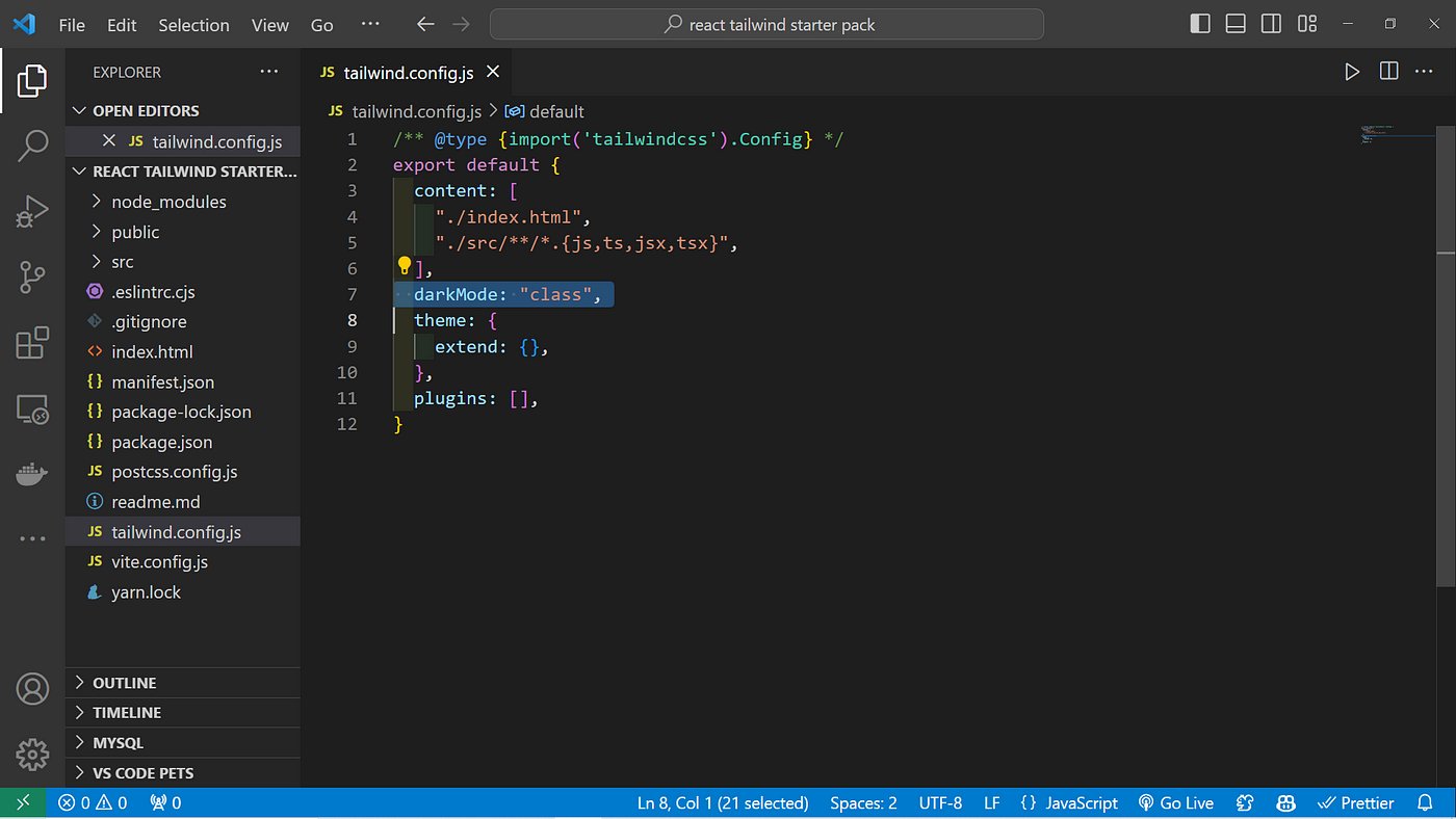
Tailwind CSS has built-in support for dark mode. To enable it, modify the tailwind.config.js file
The darkMode configuration option determines how the dark mode variant will be activated. There are a few different options available:
- true Dark mode is enabled globally for the entire application.
- false Dark mode is disabled.
- media Dark mode is activated based on the
prefers-color-schememedia query. If the user's system preference is set to dark mode, the dark mode styles are applied. - class Dark mode is controlled by adding a class to the HTML element when dark mode is active.
darkMode: "class"In this example we are going to use class Based DarkMode
/** @type {import('tailwindcss').Config} */
export default {
  content: [
    "./index.html",
    "./src/**/*.{js,ts,jsx,tsx}",
  ],
  darkMode: "class",
  theme: {
    extend: {},
  },
  plugins: [],
}j
Step 2: Creating Toggle Functionality
- first, we will create a dark mode button with sun icon when dark mode is on and moon icon when its light icon.
note: I have used react-icons for sun and moon icons
<button onClick={()=> darkModeHandler()}>
      {

          dark && <IoSunny /> // render sunny when dark is true
      }
      {
          !dark && <IoMoon /> // render moon when dark is false
      }
 </button>
2. Write a logic darkModeHandler() file
if the value of dark is false then it will change it to true and vice versa.
and toggle add dark if it present in classList and remove it if already present in classList
const [dark, setDark] = React.useState(false);

    const darkModeHandler = () => {
        setDark(!dark);
        document.body.classList.toggle("dark");
    }
Complete code for above two sub steps
import { faMoon } from "@fortawesome/free-regular-svg-icons";
import React from "react";
import { IoMoon } from "react-icons/io5";
import { IoSunny } from "react-icons/io5";
import { IconContext } from "react-icons";

function App() {

    const [dark, setDark] = React.useState(false);

    const darkModeHandler = () => {
        setDark(!dark);
        document.body.classList.toggle("dark");
    }

    return (
        <div className="bg-yellow-">
            <button onClick={()=> darkModeHandler()}>
                {

                    dark && <IoSunny />
                }
                {
                    !dark && <IoMoon />
                }
            </button>
        </div>
    );
}

export default App;
Step 3: Applying Theme Changes
Control Dark Mode by adding dark keyword to class list of HTML Tag
synatx:
<div className="dark:bg-blue-900">
  :
  :
</div>
Step 4: Complete code
import { faMoon } from "@fortawesome/free-regular-svg-icons";
import React from "react";
import { IoMoon } from "react-icons/io5";
import { IoSunny } from "react-icons/io5";
import { IconContext } from "react-icons";


function App() {

    const [dark, setDark] = React.useState(false);

    const darkModeHandler = () => {
        setDark(!dark);
        document.body.classList.toggle("dark");
    }

    return (
        <div className="bg-yellow-100 dark:bg-blue-900">
            <button onClick={()=> darkModeHandler()}>
                {

                    dark && <IoSunny />
                }
                {
                    !dark && <IoMoon />
                }
            </button>
        </div>
    );
}

export default App;
We have successfully DarkMode in react using tailwind CSS.

If there is any question or confusion regarding the tutorial. Feel free to ask your questions in the comments below.
Thank you for reading this article. If you found this helpful and interesting, please clap and follow me for more such content.
you can also check out my new app on playstore here
must Have chrome extension if you are applying for job click here
If I got something wrong, mention it in the comments. I would love to improve.
